MAKING SENSE
How often do you think about how you navigate the world? What senses do you use? And how much does each affect your life?
Goal:
Create an experience where individuals interpret the way they value their senses before and after action.
Skills:
UX Design
Prototyping - digital and analogue
Storyboard Creation
Usability Testing
RESEARCH
This project was inspired by my project about accessibility for the blind. My goal was to translate that project's core to a more lighthearted activity.


Kacey Ballard
PhD, MA in Psychology
BA in Integrative Biology, Art History
50% of our brains are used for visual perception, including motion and color.
Multitasking: vision and hearing are separate, but vision dominates, explaining why we turn the radio down when parking for example.
ANALOGUE
The project began as a participatory physical exhibit. It involved sections for participants to experiment with touch, taste, smell, and hearing.
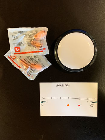
The exhibit required each participant to use blindfolds, nose clips, and earplugs. Each station had all other supplies needed for the experience.
PROTOTYPING AND TESTING
LOW FIDELITY
Insights
-
Users did not like using the blindfold.
-
Users felt nose clips hurt.
-
Gloves worked well to dull sense of touch.
MID FIDELITY
Design Shortcomings and Strengths
-
Bag did not hide objects well.
-
Bag did not secure the object to stay in a specified area; objects could fall out
-
Box with flap hides objects and provides easy access.
-
The box and cube with coffee glue on worked as the object for the smell station; however, it was unsightly.
Testing Set Up
Each station was set up with objects needed to try activity. Stations included cards to rate how the participants valued each sense.
Usability Testing Insights

Karlo I.
Product Manager
-
confused by order of wording in taste station instructions
-
wanted instructions to unwrap food
-
wondered how to share reactions
-
felt the hearing audio instructions would give other participants too much information about the station

Mike M.
Software Engineer
-
closed eyes before reading all of the instructions
-
confused by order of wording in taste station instructions
MOVE TO DIGITAL
The project began as a participatory physical exhibit. It involved stations for participants to experiment with touch, taste, smell, and hearing.
The transition to an internet platform changed the dynamics of interaction. Participants must now have a partner and provide their own materials for the experience.
COLORWAYS
DIRECTION STYLE
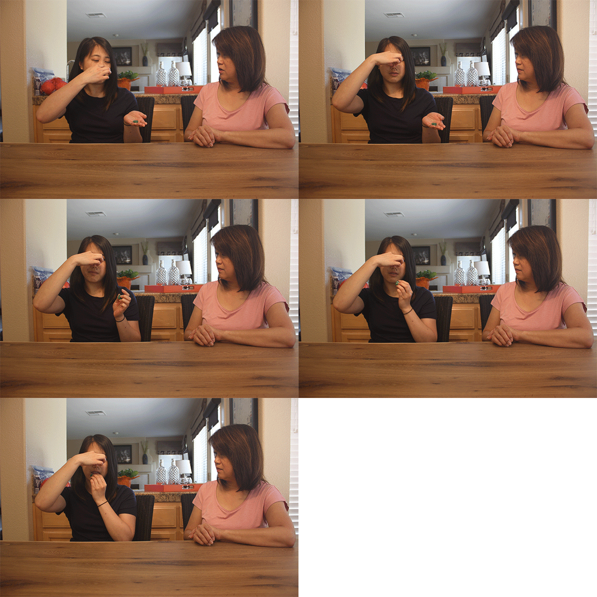
The final direction style is still photos and GIFs accompanied by written instructions. GIFs show more detail and easier "how to".
USABILITY TESTING AND INSIGHTS
VIA VIDEO CALL

Insights from Users and Peers
-
Instructions were clear and not too vague.
-
Users wanted a way to reflect with a survey or type of follow up.
-
Users didn't know the project's top navigation was clickable (not pictured above).
-
Project doesn't look like a separate project from portfolio.
FINAL PRODUCT
Colors are more playful and bright. Symbols are used for ease of recognition.

Each sense is divided into its own section. Directions are laid out step by step with both still and moving pictures. Anchor menu replaced by top navigation.

Participants can add their thoughts and questions and respond to other participants.

FINAL TAKEAWAYS
Interaction design is often times thought of as living in the digital realm. While some products/projects can be easily translated from one medium to another, some projects lose some of their richness. While this project does work online, part of the experience the physical version offered is now lost.


